Mobile Experience
On screens smaller than 1024px wide (tablets and phones), FlowQMS adapts its layout:
Bottom Navigation Bar
A fixed bar appears at the bottom of the screen with four quick-access buttons:
- Dashboard — Go to the main dashboard
- Quality Issues — Go to the NCR list
- Documents — Go to the document list
- AI Assistant — Open the AI assistant
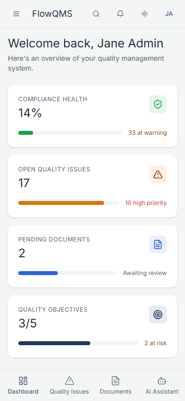
Dashboard on mobile devices
Hamburger Menu
- The sidebar is hidden by default on mobile
- Tap the hamburger icon (three lines) in the top-left corner of the header to open the full sidebar as an overlay
- Tap any menu item to navigate, or tap outside the sidebar to close it
Responsive Tables
- Data tables on mobile show fewer columns and may enable horizontal scrolling
- Cards and panels stack vertically instead of side-by-side
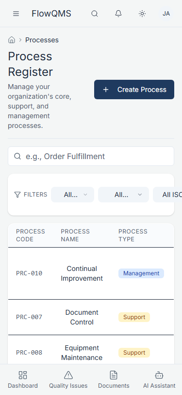
Process list on mobile
Previous: Dark Mode | Next: Dashboard Overview